Thursday, February 24, 2011

Ethnography Results - Week 4


This week, I went to Schotzi's again on Thursday night to watch two bands: Shane Smith and The Secret of Boris. The website said that it would start at 9:00, but when I arrived at 9:30 they were still in the process of sound testing. In fact, they continued sound testing until about 10:10, at which point some of the band actually did some karaoke inside. Despite the large genre difference between the artists, they actually seemed to have a rapport with one another.


As far as attendance went, by 10:00 there were only 20 people in the bar, not including the artists. By 11:00, there was only somewhere between 30 and 35. At about 11:30 however, that number nearly doubled. I do believe that this increase is due more to the time than the bands, because most of these people didn't go outside or upstairs to watch them.


By the time I left at slightly past midnight, nearly 100 people were in the bar as a whole, but only about 20 were outside with Shane Smigh and 5 were upstairs with the rock band. I am curious if this is due more to the day or the bands.

Next week, I am going to delay heading to the bar until 10:30 or 11, since it appears that the artists rarely get started until then.

Paper Reading #12 - Cosaliency

Comments:
Comment 1
Comment 2

References:
Title: Cosaliency: Where People Look When Comparing Images
Authors: David E. Jacobs, Dan B. Goldman, and Eli Shechtman
Venue: UIST 2010, Oct 3-6, 2010

Summary:
In this paper, the authors discuss a computerized method of locating the changes between a pair of images. This algorithm would be useful in a situation they call "image triage," in which a photographer needs to decide which images to keep and which images to delete on a camera, usually to open space for more photos. To assist with the design of this algorithm, they come up with a concept called cosaliency, which is similar to image saliency, where you are trying to find the important part of an image, but instead between two pictures.

They began by creating a research project on Amazon Mechanical Turk wherein they asked the workers to compare series of image pairs and select small crops of the images that they thought had the biggest changes in them. From this data, they created an equation to model this behavior, and then applied it in their software for cropping. Finally, they generated images cropped by this algorithm and again used Amazon Mechanical Turk to determine how much people liked them. In general, they found that the users liked it more than traditional methods.

Discussion:
I liked this article because it used hard numerical data to back up its points. Even though it used a lot of jargon that I was unfamiliar with, the equations they showed were all solid and it provided plenty of images to demonstrate the process. For this reason, I am confident in the usefulness of this paper.

From a content perspective, I am not a huge photographer, but I can see how useful this would be to people who do like to take photos. This and many of the other works that they mentioned as they created their new algorithm will surely help make the newer model digital cameras even easier to use.

Wednesday, February 23, 2011

Paper Reading #11 - Web Automation

Comments:
Comment 1
Comment 2

References:
Title: A Conversational Interface to Web Automation
Authors: Tessa Lau, Julian Cerruti, Guillermo Manzato, Mateo Bengualid, Jefferey P. Bigham, and Jeffrey Nichols
Venue: UIST 2010, Oct 3-6, 2010

Summary:
In this paper, the authors describe a server-based web script service that works automatically based on web commands. This interface, called CoCo (short for CoScripter Concierge, not Conan O' Brien) can take short commands from twitter, email, or SMS and quickly find and use a web script to automate the required task on its own.

It does this in three steps. First, it parses the plain language passed in for the parameters using a simple engine made by the authors. Then, if the command has been used before, CoCo uses the same script as before and runs the task with the parameters given. However, if CoCo has not run the task before, it tries two things to find a script. First, it mines the web history of the user to find a task and attempts to use those scripts to solve the problem. Failing that, it searches the CoScript database for a matching script and uses that instead. Finally, CoCo sends a response back to the user indicating the success or failure of the task.

After showing the run process and giving some usage examples, the authors show some statistics to prove that the text returned by CoCo of success or failure is useful to the user. They found that it worked as well as pictures to indicate that the job was completed correctly.

Discussion:
This paper was interesting for similar reasons to those of Watson from Jeopardy. Strong sentence syntax recognition is important to make computers easier for those who aren't very computer literate. Interfaces like these could be quite useful for other programs as well, for example that playlist maker from a few papers ago.

However, one thing that I definitely find unnerving is the data mining segment of this application. I can see why it would be useful, but I feel that data mining of any sort is an unsafe proposition, especially when the data is being sent to an external server. If a company was selling this software full time, they could probably use that data for possibly unsavory purposes.

(Picture courtesy of: popwatch.ew.com)

Book Reading #1 - Design of Everyday Things

Comments:
Comment 1
Comment 2

References:
Title: The Design of Everyday Things
Author: Donald A. Norman
Editor: Judy Greissman, 1988

Summary:
In this book, Norman describes the psychology behind how we use objects in our daily lives and applies this knowledge to give us rules to abide by during the design process. Throughout he gives examples to show both good and bad designs, often with pictures. These examples and tips come together to help us avoid badly designed products, like the quite awkward gun to the left.

Norman divides the chapters into sections based on processes of the mind you must cater to during the design process, including: actions, memory, visibility, and errors. In each section, he gives models of the brain as psychologists understand it and then details design concepts that assist the brain in using your product correctly. Some of the design tips he gives include constraints, standards, natural mappings, and mental models. Finally, he has a short section on how to make objects intentionally difficult to use for security or safety purposes.

References:
I think this book has done the best job so far of showing the usefulness of HCI in the design process of everything we have read. The concepts he presents here are useful not only in the design of physical products but also in the design of software and even games. Of all the books that have been presented so far, this is definitely the one most likely to stay on my bookshelf. On the not-so-bright side, the book has no tips for making good-looking designs, so anything made using only this as a manual would probably look extremely utilitarian.

(Image courtesy of: ssw.com)

Tuesday, February 22, 2011

Microblogs #5 - Emotional Design

References:
Title: Emotional Design
Author: Donald A. Norman
Venue: Jo Ann Miller, New York, 2004.


Chapter #1:
Summary:
In this chapter, Norman introduces the concepts of emotion and how it affects the perceptions of our designs. He then talks about the levels of processing in the brain and how they interact in our daily lives.

Discussion:
I found this chapter interesting because I never thought of dividing up the processes of the mind before, but now that he describes them, they seem quite natural. I also liked the concepts of what cause positive and negative "affect." Keeping these in mind during the design process would be a good idea.


Chapter #2:
Summary:
In this chapter, Norman goes deeper into the details of the three emotional processes in the brain and how to design for each. He then goes onto an extended trip through the reflective process and describes how products and brands manipulate this process to make money.

Discussion:
I thought this chapter was quite interesting because I never thought about how much work companies put into leaving behind good memories for the user. I had heard of companies spinning off divisions to make a new name before, but to hear some of the reasons why it was successful was also intriguing.


Chapter #3:
Summary:
In this chapter, Norman describes the different basic concepts of each of the three types of design in detail. He then mentions the interplay between each of these designs in many different stores, and closes by talking about group design versus individual.

Discussion:
This chapter was most interesting at the very end, where Norman talks about the psychology behind the layout of stores. I never before realized that stores purposely put items in the back so that you have to walk through the entire store in the hopes that you'll buy something else. The section talking about individual versus group centered design was also very interesting for people like me who want to go into video games, because that's a situation that video game designers find themselves in.

Monday, February 21, 2011

Ethnography Results - Week 3

I was unable to attend a concert during the last week, and as such, have no data to present for this week.

Sunday, February 20, 2011

Paper Reading #10 - Designing Adaptive Feedback

Comments:
Comment 1
Comment 2

References:
Title: Designing Adaptive Feedback for Improving Data Entry Accuracy
Authors: Kuang Chen, Joseph M. Hellerstein, and Tapan S. Parikh
Venue: UIST 2010, Oct 3-6, 2010
Summary:
In this paper, the authors describe a new method for data entry that uses prediction to minimize error rates. The method is called USHER and works by building a probabilistic model that figures out the likelihood of potential entries. It then offers defaults, highlights likely options, and gives warnings. By using this system, the authors hope to decrease entry error rates while also avoiding using the technique of double entry.

They then test the effectiveness of their system by building a java frontend for USHER and having African data entry clerks enter a series of medical entries into a database. These entries were premade for the experiment and were checked for validity afterwards. They discovered that while defaults made the process quicker, they did not decrease the error rates. However, the highlighting system made a significant difference.

Discussion:
There are a lot of reasons why I like this paper. First off, they did a good job of using hard scientific data to back up their claims. Many of the papers so far did not do this. Second, they used some concepts from cognitive psychology that are similar to the ones we learned from The Design of Everyday Things. Finally, they showed practical applications for the technology that could be used later.

As far as the data entry is concerned, I definitely support this method. I have done data entry in the past and it's very boring; I often let my mind wander when I was doing the entries. In the medical world, where data entry is common, this is a very bad thing. Hopefully by adding these entries in, less errors will be made.

(Image courtesy of: anecdote.com)

Tuesday, February 15, 2011

Paper Reading #9 - Creating Collections

Comments:
Comment 1
Comment 2

References:
Title: Creating collections with automatic suggestions and example-based refinement
Authors: Adrian Secord, Holger Winnemoeller, Wilmot Li, Mira Dontcheva
Venue: UIST 2010, Oct 3-6, 2010

Summary:
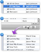
In this paper, the authors describe a new hybrid method of creating playlists that merges automatic and manual creation methods; they then show two programs they created for managing media using this method, SongSelect and PhotoSelect. They begin by talking about automatic playlist making methods like iTunes' Genius tool and how many users thought it didn't give them what they want. Then, they discussed how many users selected music for their playlist that sufficed instead of looking for a best candidate despite having concrete goals, a method they call satisficing. So, when they designed their two applications, they kept a two step process: keywords are entered into a box that automatically generates a set of songs or pictures meeting the criteria; then, the user selects the best media for the list. Furthermore, the user can get further suggestions from the list if necessary to further customize their choices.

Discussion:
I thought that this paper was interesting because it's trying to solve an issue that I run into often. As they mention in the article, automatic playlist makers often give unsatisfying results, and doing it manually is a giant chore. I actually hope that this idea takes off.

However, and this is really picky of me to mention, I didn't like the use of a portmanteau inside of a professional paper. I feel like it looks unprofessional, and they could have still gotten their point across without it.

(image courtesy of: megaleecher.net)

Monday, February 14, 2011

Ethnography Results - Week 2

For this week's ethnography, we went to Schotzi's and watched Lindsay Harris, Meagan Moseley, and The Heart is a Lonely Hunter. We noticed that despite the start time being listed as 9:00, they started sound testing then and the bar was quite empty. Below as we go through the different bands you can see pictures of how crowded it was as the band was playing.

Lindsay Harris started the night, and as shown on the right not a lot of people were there during the act, although people started milling in at the end of the act. We noted that there was no large demographic that was greater than any of the others.


By the time Meagan Moseley started at about 11, the bar was packed. We later found out that this was partly because a lot of her family and friends came, but additionally a large country crowd gathered at this point, shifting the demographics.


After Moseley left the stage, the majority of the country crowd filtered out, leaving a much smaller group with heavy counter-culture demographics.


In general, I was intrigued by the shifting in crowd size and demographics that we saw that night. I am interested to see in the coming nights whether we will see crowds ebb and flow with the genres of each band like tonight, or whether the shrinking and growing of the crowd was connected more with the time.

Friday, February 11, 2011

Paper Reading #8 - Exploring Mobile Technologies

Comments:
Comment 1
Comment 2

References:
Title: Exploring Mobile Technologies for the Urban Homeless
Author: Christopher A. Le Dantec
Venue: CHI EA 2010, April 10-15, 2010

Summary:
In this paper, Le Dantec describes a study he performed to examine the effects of technology on the homeless. He executed two studies: one on the homeless directly and another on nonprofit agencies that assist them. From his studies of the homeless, he determined that technology made for the homeless doesn't only need to be designed cheaper; it also needs to be designed specially for them. From his second study, he discovered that nonprofit organizations had trouble keeping stable workforces because of their volunteer nature as well as how they needed to be tailored to their environments. Finally, he describes a system he is building utilizing smartphones called the Community Resource Map that should help the homeless find shelters, soup kitchens, and other services that can help them in their daily lives.

Discussion:
I'm not really sure how to feel about this paper. On one hand, it is important to bring technology to all people, regardless of status; however, as of now his method using smartphones seems impractical given that most homeless wouldn't be able to afford such devices.This isn't to say that in another 10 years this design would be feasible, but I just feel that there is probably a better answer that could be implemented sooner.

Additionally, I am curious about the methodology of Le Dantec's studies, as they are never really mentioned at all outside of their results. I would assume this is because of limited space, but it would have lent credibility to the paper if we could have seen how these conclusions were found.

(Image courtesy of The New Digital Divide)

Wednesday, February 9, 2011

Paper Reading #7 - Projected User Interface

Comments:
Comment 1
Comment 2

References:
Title: Public Issues on Projected User Interface
Authors: Ju-Chun Ko, Li-Wei Chan, and Yi-Ping Hung
Venue: CHI EA 2010, April 10-15, 2010

Summary:
In this paper, the authors discuss the issues of using portable projector systems in public places. With the advent of pico projectors that are so small that they are now being integrated into phones as well as devices such as SixthSense (pictured on the left), the authors pose questions about their use in public spaces. They begin by discussing the implications of privacy. When you use these sorts of devices in public, your projection can not only be viewed by you, but by everyone nearby, which could create awkward situations if the viewed content was personal. Additionally, if multiple people are using these projection devices, they could intrude upon each other's projection areas. Finally, the authors discuss where it is OK to project. They pose the question that even though it is possible to project onto any surface, is it legal to project onto someone else's property or even onto them correctly?

Discussion:
I found this article interesting not only because I had never heard of this SixthSense device before, but also because I never thought about the personal implications of these devices. Being able to use any surface as a giant screen would be extremely useful in many situations, but with all of these drawbacks it is clear that work needs to be done on making them usable in public.

My roommate and I had a discussion on this, and we both wondered outside of size concerns, why these devices couldn't project onto a pair of glasses. Projecting onto this closer surface would give a similar "screen size" advantage due to human perception, while also allowing personal privacy to the viewer and avoiding many of these problems.

(Image courtesy of: sigchi.org)

Tuesday, February 8, 2011

Ethnography Results, Week 1

For the first week, I sat in on the seminar class and observed how they took notes. There were approximately 47 students and 6 of them were using laptops. Of that portion, two appeared to be taking notes in Microsoft Word or similar. One was on Facebook the majority of the class, and two were working on programming. The remaining two seemed to be surfing the internet the majority of the class. Qualitatively, I didn't feel like many people in general were taking good notes even if they didn't have laptops. If I continue this study, I would like to try a different class to see if the lack of attention was due to just that class in particular.

However, I think I am going to switch topics. I have heard about some of the other groups and believe that the results would be easier to get as well as being a bit more fun to research.

Friday, February 4, 2011

Paper Reading #6 - Who are the Crowdworkers?

Comments:
Comment 1
Comment 2

References:
Title: Who are the Crowdworkers? Shifting Demographics in Mechanical Turk
Authors: Joel Ross, Lilly Irani, M. Six Silberman, Andrew Zaldivar, and Bill Tomlinson
Venue: CHI EA 2010; April 10-15, 2010

Summary:
In this paper, the authors take a survey of a popular crowdsourcing service, Amazon Mechanical Turk, to determine who does these tasks and to see if the demographics of these people has changed. Amazon Mechanical Turk is a service in which companies may post simple tasks that are difficult for a computer to perform, for example transcribing an audio clip, tagging a picture, or taking a survey, and have people perform these tasks for an amount of money equal to the size of the task. The authors posted up a two minute survey with a payment of ten cents for users of the service that asked questions about the user's country of origin, education, sex, and income. What they discovered was that the service was becoming increasingly international, with India leading the way. Additionally, whereas females were more numerous on the service before, males were bridging the gap. Finally, they found out that a greater slice of users, especially international users, were using the service as a sort of full or part-time job. They then concluded by saying that because people are using this as a full-time job, HCI needs to do research into these services to make it easier for users to make money.

Discussion:
I found this paper to be interesting because I had never heard of this concept of crowdsourcing. The fact that companies are giving out small tasks that computers cannot do is really cool, and the fact that people can make enough money off of it to live is equally interesting. However, I do have to agree with the authors of this paper -- if people are using this as a full-time job, research needs to be done to make sure that the users of sites such as Amazon Mechanical Turk are getting fairly paid.

(Image courtesy of: vatornews)

Wednesday, February 2, 2011

Brief Ethnography Proposal

I would like to study the note-taking habits of college students, especially with consideration to taking notes on paper versus on a laptop. I would like to learn whether that stigma of laptop users spending their time surfing the internet is really true, as well as if they slack off in class more than people taking notes on paper. For two hours a week, I would just go to two other classes, perhaps on one MWF class and another TR class, (with the professor's permission) and observe the students' note-taking habits. Quantitatively, I would get numbers of people on laptops versus notepads or nothing at all, as well as numbers on how many surf the internet or draw on their notepads. Qualitatively, I will observe how many of them seem to be paying attention based on eye contact and how often they ask questions. While interacting with the students isn't technically necessary, getting interviews from them at the end of the experiment time might be helpful.

Special Reading #3 - Contextual Gaps

Comments:
Comment 1
Comment 2

References:
Title: Contextual Gaps: Privacy Issues on Facebook
Authors: Gordon Hull, Heather Richter Lipford, and Celine Latulipe
Venue:

Summary:
In this paper, the authors describe the changing face of privacy in online social networking services using Facebook as the example. At the start of the article they describe the changing social norms online through blogging and webcams, using examples such as Jennicam and Washingtonienne to illustrate the problems they have caused. The authors then map these same social issues to Facebook's applications and news feed. They talk about the silent sharing of data from Facebook to these applications, and how many people are completely unaware that the applications are actually sharing data at all. They then ask that the users be better informed of the applications' data mining by having a page display the information shared with pictures of their friends. Then the authors talk about the news feed, and how on the inception of the news feed service, a huge backlash ensued. They then talk about how users apply a social context to their actions online like they do in real life, and when a large change like the feed occurs, the sudden change changes the users' concepts of that context. They then mention that after a while when peoples' contexts adapted, the complaints died out. They then describe some slight changes that might improve Facebook's news feed.

(Image courtesy of Technorati.)

Tuesday, February 1, 2011

Paper Reading #5 - Connect 2 Congress

Comments:
Comment 1
Comment 2

References:
Title: Connect 2 Congress: Visual Analytics for Visual Oversight
Authors: Peter Kinnaird, Mario Romero, and Gregory Abowd
Venue: CHI EA 2010, April 10-15, 2010

Summary:
In this paper, the authors describe a web application they created called Connect 2 Congress, as well as how this software will allow better analysis of politicians' voting practices. Connect 2 Congress is a web application coded in PHP, MySQL, Java, and Javascript; it displays voting data over a user-determined period of time. There are two different graphs for the house and senate for each bill, and a graph in four quadrants shows each representative's liberal or conservative stance, as well as a leader or follower index, which shows how much they had to do with introducing bills. Furthermore, users can choose to highlight individual representatives or search by name or state. The authors hope that this application could be helpful to political strategists and journalists, and they go on to mention that they believe it would be too complicated for the average voter.

Discussion:
While the paper itself is solid, I think the application misses its target in a way. To me, a web application means you're trying to reach a large audience, but the application itself is too complex for a regular person, even though they mention that they aren't the target in the paper. Instead, I think I would focus on making this application for desktops, since newspeople and analysts that they mentioned as the target audience have powerful computers that could probably crunch the numbers in closer to real-time (a problem they mentioned.)

(Picture courtesy of: VA Watchdog)